Brand Guide
Introduction
As Dabilu Sports is currently in the process of transforming from a small startup company to a bigger corporation, we felt the need to develop a Styleguide for our brand. It consists of three main parts: the brand guide, the defined CSS methodologies and the component library to be used.
The aims of this Styleguide are:
- Provide our developers, designers and copywriters a consistent structure and orientation when creating new components for our branded websites.
- Ensure that the public has the best possible experience when interacting with our websites.
Colors
The primary brand colors are used to represent Dabilu Sports in public and must reflect the Dabilu Sports brand. These colors are part of our corporate identity.
Primary Colors
Our complete design relies on these colors..testclass {
backgroundcolor: $porcelain;
}If colors are used in SCSS classes, they may only be applied as variables. All colors we are using have their own variable.
Shadows
.shodow-class {
  color: $color-shadow;
  ...
}
Primary
.primary-class {
  color: $color-primary;
  ...
}
Accents
.accent-class {
  color: $color-accent;
  ...
}
Background
.background-class {
  color: $color-background;
  ...
}
Background Shade
.background-shade-class {
  color: $color-background-shade;
  ...
}
Inverted Background
.background-invert-class {
  color: $color-background-invert;
  ...
}
Text
.text-class {
  color: $color-text;
  ...
}
Weak Text
.text-weak-class {
  color: $color-text-weak;
  ...
}
Strong Text
.text-strong-class {
  color: $color-text-strong;
  ...
}
Headings
                .heading-class {
  color: $color-text-heading;
  ...
}
Inverted Text
.text-invert-class {
  color: $color-text-invert;
  ...
}
Text Link
.text-link-class {
  color: $color-text-link;
  ...
}
Text Link Visited
.text-link-visited-class {
  color: $color-text-link-visited;
  ...
}
Text Link Hover
.text-link-hover-class {
  color: $color-text-link-hover;
  ...
}
Border
.boder-class {
  color: $color-boder;
  ...
}
Typography
Typefaces
Summary: Use Montserrat for headlines, and Open Sans for running text.
Open Sans
Open Sans is a sans-serif typeface, containing 897 characters, including the standard ISO Latin 1, Latin CE, greek and Cyrillic character sets. According to Google, Open Sans was designed "with an upright stress, open forms and a neutral, yet friendly apperance." Furthermore, it "was optimized for print, web, and mobile interfaces, and has excellent legibility characteristics in its letterforms." This makes Open Sans an obvious choice for large sections of running text, and thus is used everywhere except in headings and code snippets.a b c d e f g h i j k l m n o p q r s t u v w x y z
A B C D E F G H I J K L M N O P Q R S T U V W X Y Z
Montserrat
Montserrat is an open-source sans-serif typeface, originally inspired by old posters and signs in the traditional neighborhoud of Buenos Aires called Montserrat. It was designed for good readability and is well-fitted for use in combination with Open Sans, underlining our corporate identity. Thus, Montserrat is used for all headlines.a b c d e f g h i j k l m n o p q r s t u v w x y z
A B C D E F G H I J K L M N O P Q R S T U V W X Y Z
Font Sizes
A default base size of 16px is assumed. A scale of 1.333 (Perfect Fourth) is used for increased clarity. Running text should be in medium size, headings are larger. Small font size is used, for example, for time stamps and legal information such as General Terms and Conditions.
Extra extra extra large - 3.157em (50.15px)
Extra extra large - 2.369em (37.904px)
Extra large - 1.777em (28.432px)
Large - 1.333em (21.328px)
Medium - 1em (16px)
Small - 0.75em (12px)
Extra small - 0.563em (9.008px)
<p class="font-size-xxxl">...</p>
<p class="font-size-xxl">...</p>
<p class="font-size-xl">...</p>
<p class="font-size-l">...</p>
<p class="font-size-m">...</p>
<p class="font-size-s">...</p>
<p class="font-size-xs">...</p>
Logo
This section contains the Logo Usage Guidelines for Dabilu Sports.
Logo Artwork
The Dabilu Sports Logo is comprised of the two laurel leafs on the left and right side, the three stars in the middle on top (mark) and the Dabilu Sports lettering (logotype).
The logotype is custom designed lettering and should never be replaced by a font or any other type.
The mark and logotype must never be used seperately!
Color
When color is an option the following colors must be used (usage as shown in the logo image above):
You can find all the available colors in the Colors section.
Size
The dimensions of the artwork have been selected accordingly and should never be altered. Examples below show improper usage:
Minimum Size
For maximum performance, it is recommended that the minimum size for reproduction of the artwork is 90 pixels in width, whilst retaining the original set dimensions. This roughly equates to 24mm across on paper.
Minimum Clear Space
To protect the integrity of the Dabilu Sports brand and to achieve maximum recognition, it is important for assisting graphical elements, or other company logos, to not be in direct contact with the Dabilu Sports logo artwork.
By visually imagining a containing box around the artwork, any assisting elements should be at least a "D"s width away from the logo artwork.
CSS Methodology
Code Style
(S)CSS is the main language for styling Dabidu's website. In order to maintain good code readability and ensure that the (S)CSS code is written in a consistent way, some rules need to be followed:- Indentation: Two spaces must be used. This ensures that code renders the same in every environment.
- Rule declaration: Rules must be formatted as shown in the example below.
Note the spaces, the semicolons, and the placement of the braces. Furthermore, do not forget to follow the class naming rules.
Good
  .block__element--modifier {
  color: $color-primary;
  font-family: 'Open Sans', sans-serif;
}
Bad
.block__element--modifier, .block{ color:#2C3e50; font-family: 'Open Sans',sans-serif } - Single declarations: Even if a rule only include a single declaration, do not omit line breaks, i.e. do not write everything into one single line. This makes it easier to extend the rule if necessary.
- Units: Use relative lengths such as >em whenever possible, as opposed to using px for everything.
- Zero values: Do not specify units for zero values, i.e use 0 as opposed to 0px, 0em, etc.
- Files: Use UTF-8 encoding and add a new line at the end of the file.
- Quotations marks: Use single 'quotation marks' when possible.
While some of these rules are checked through linting, as described in section Pre-Processors, the programmer must not solely rely on linting, but keep the rules in mind and follow them thoroughly.
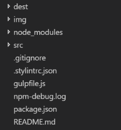
File Structure
To ensure a consistency, the file structure of websites should follow a basic guideline. As way of example, the file structure of this CSS styleguide is explained in this section.
In the main folder, the configuration files can be found:
- .gitignore: Specifies intentionally untracked files to ignore
- .stylintrc.json: Contains the rules for the CSS linter. Must not be changed!
- gulpfile.js: Configures gulp, the build system of choice for our front-end web development.
- package.json: All used npm modules are specified here, making it easy for every developer to install the needed modules.
Furthermore, there are 3 important folders:
- img: Contains all images which are used throught the website.
- src: Contains the SCSS files, which can be edited by the developer.
- dest: Herein the compiled CSS files can be found, which should not be edited manually! Furthermore, the HTML files are also in here.
Pre-Processors
The building process of the CSS files makes use of gulp and PostCSS and consists of several steps:
- The SCSS files are linted using stylelint, enforcing consistent conventions throught all SCSS files.
- The SCSS files are converted to CSS files through the use of gulp-sass, which is a wrapper around node-sass, which in turn utilizes libsass, which is a fast C/C++ port of the Sass CSS precompiler.
- The CSS files are now analyzed and modifed by Autoprefixer in order to automatically add vendor prefixes to the existing CSS.
Class Naming
Our styleguide follows the Block, Element, Modifier Architecture. Every CSS class has to be named according to the following rules. This section is a citation from: http://getbem.com/naming/
Block
Encapsulates a standalone entity that is meaningful on its own. While blocks can be nested and interact with each other, semantically they remain equal; there is no precedence or hierarchy. Holistic entities without DOM representation (such as controllers or models) can be blocks as well.
Naming
Block names may consist of Latin letters, digits, and dashes. To form a CSS class, add a short prefix for namespacing: .blockHTML
Any DOM node can be a block if it accepts a class name.<div class="block">...</div>CSS
Block names may consist of Latin letters, digits, and dashes. To form a CSS class, add a short prefix for namespacing: .block.block {
color: $color-primary;
}Element
Parts of a block and have no standalone meaning. Any element is semantically tied to its block.
Naming
Element names may consist of Latin letters, digits, dashes and underscores. CSS class is formed as block name plus two underscores plus element name: .block__elem
HTML
Any DOM node within a block can be an element. Within a given block, all elements are semantically equal.
<div class="block">
  ...
  <span class="block__elem">...</span>
</div>
CSS
- Use class name selector only
- No tag name or ids
- No dependency on other blocks/elements on a page
Good
.block__elem {
  color: #042;
}
Bad
.block .block__elem {
  color: #042;
}

div.block__elem {
  color: #042;
}
Modifier
Flags on blocks or elements. Use them to change appearance, behavior or state.
Naming
Modifier names may consist of Latin letters, digits, dashes and underscores. CSS class is formed as block’s or element’s name plus two dashes: .block--mod or .block__elem--mod and .block--color-black with .block--color-red. Spaces in complicated modifiers are replaced by dash.
HTML
Modifier is an extra class name which you add to a block/element DOM node. Add modifier classes only to blocks/elements they modify, and keep the original class:
Good
<div class="block block--mod">
  ...
</div>
<div class="block block--size-big block--shadow-yes">
  ...
</div>
Bad
<div class="block--mod">
  ...
</div>
CSS
Use modifier class name as selector:
.block--hidden {
  ...
}
To alter elements based on a block-level modifier:
.block--mod .block__elem {
  ...
}
Element modifier:
.block__elem--mod {
  ...
}
Component Library
Headings
Take a look at the typography section for additional information on font sizes.
Heading level 1
<h1 class="heading heading--extra-large">...</h1>Heading level 2
<h2 class="heading heading--large">...</h2>Heading level 3
<h3 class="heading heading--medium">...</h3>Heading level 4
<h4 class="heading heading--small">...</h4>To keep a clear and simple structure, heading level 5 (h5) and 6 (h6) must not be used.
Lists
If the ordering of the items you want to display is relevant, use an ordered list. Otherwise use an unordered list.
Ordered Lists
- This is the first list item.
- This is the second list item,
including a line break. - This is the third rather long list item, which may take up multiple lines of space: Lorem ipsum dolor sit amet, consectetuer adipiscing elit. Aenean commodo ligula eget dolor. Aenean massa. Cum sociis natoque penatibus et magnis dis parturient montes, nascetur ridiculus mus. Donec quam felis, ultricies nec, pellentesque eu, pretium quis, sem.
- This is the fourth and final list item.
<ol class="list list--ordered">
  <li class="list__item">...</li>
  <li class="list__item">...</li>
</ol>
Unordered Lists
- This is a list item.
- This is another list item,
including a line break. - This is another rather long list item, which may take up multiple lines of space: Lorem ipsum dolor sit amet, consectetuer adipiscing elit. Aenean commodo ligula eget dolor. Aenean massa. Cum sociis natoque penatibus et magnis dis parturient montes, nascetur ridiculus mus. Donec quam felis, ultricies nec, pellentesque eu, pretium quis, sem.
- This is another list item.
<ul class="list list--unordered">
  <li class="list__item">...</li>
  <li class="list__item">...</li>
</ul>
Form Elements
Our forms have to be in a really good shape, just like our brand models. Here is the guide on how to implement all kinds of form elements.
Input Fields
Basic text input fields should be styled as follows:
<form class="form">
    <div class="form__flex">
      <div class="form__float">
        <label for="required_input" class="form__label">Required Field: *</label>
        <input class="form__input form__input--required" id="required_input" type="text" placeholder="Max@Mustermann.org"></input>
      </div>

      <div class="form__float">
        <label for="optional_input" class="form__label">Optional Field:</label>
        <input class="form__input" id="optional_input" type="text" placeholder="Phone"></input>
      </div>
    </div>

    <div class="form__flex">
      <div class="form__float">
        <label for="valid_input" class="form__label">Valid Field</label>
        <input class="form__input form__input--valid" id="valid_input" type="text" placeholder="Valid"></input>
      </div>

      <div class="form__float">
        <label for="invalid_input" class="form__label">Invalid Field</label>
        <input class="form__input form__input--invalid" id="invalid_input" type="text" placeholder="Invalid"></input>
    </div>
</form>
Textarea
Textareas should be styled as follows:
<form class="form">
  <label for="textarea" class="form__label">Place your thoughts</label>
  <textarea class="form__textarea" id="textarea" type="text" rows="6" cols="100" placeholder="Place for your thoughts"></textarea>
</form>
Radio Checkboxes
Radio checkboxes should follow the following style guideline:
<form class="form">
  <fieldset>
  <label class="form__label">Do you like our Styleguide ?</label>

    <input type="radio" id="likes_it" name="voting" class="form__checkbox--radio" value="awesome">
    <label for="likes_it">Yes, awesome!</label>

    <input type="radio" id="medium_like" name="voting" class="form__checkbox--radio" value="medium">
    <label for="medium_like">It's decent</label>

    <input type="radio" id="ugly_af" name="voting" class="form__checkbox--radio" value="ugly">
    <label for="ugly_af">No! disgusting</label>
  </fieldset>
</form>
Select Fields
<form class="form">
<label for="select" class="form__label">Select Field:
  <select class="form__select">
    <option disabled selected>choose</option>
    <option value="small">Dabilu Shoes</option>
    <option value="medium">Dabilu Shirts</option>
    <option value="large">Dabilu Sneakers</option>
    <option value="xxlarge">Dabilu Backpacks</option>
  </select>
</form>
Links
We differentiate between two different types of links.
- An internal link, which is a link that refers to a page on our website.
- An external link, which is a link that refers to a page other than our website.
Media Blocks
In order to write the cleanest and most readable code possible we use mixins. Mixins are groups of styles that can be reused throughout our code. One of the features of mixins is that they can use blocks of content which is especially usefull for media-queries.
They should be written like this:
SCSS - Create Mixins
Create mixins in order to be able to use named nested media queries:
$tablet-width: 768px;
$desktop-width: 1024px;

@mixin tablet {
  @media (min-width: #{$tablet-width}) and (max-width: #{$desktop-width - 1px}) {
    @content;
  }
}

@mixin desktop {
  @media (min-width: #{$desktop-width}) {
    @content;
  }
}
SCSS - Use Mixins
Use mixins as named nested media queries like that:
p {
  font-size: 16px;

  @include tablet {
    font-size: 18px;
  }

  @include desktop {
    font-size: 20px;
  }
}